In alphabetical order, here’s the second half of the 16 exhibitors who have caught my attention at the last edition of Operae: Independent Design Festival.
Less is Home

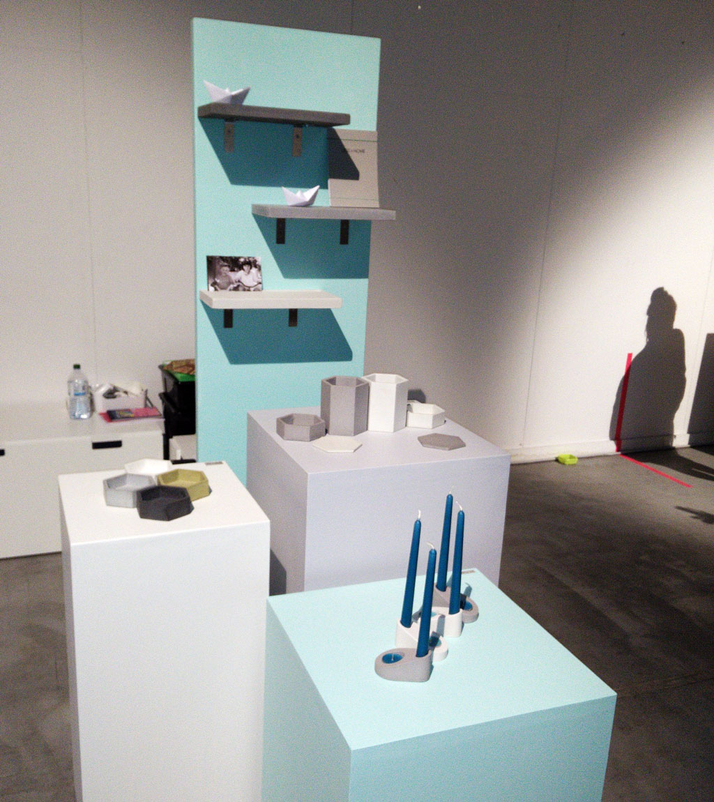
Hexagons made out of concrete: that would be enough for those who know me, but I want you to know something more about Less is Home, because the guys behind the project really deserve it. Desiree and Claudio are brother and sister and have a nice face. On the website they describe themselves this way: she has ”a dangerous inclination to DIY,” while he “combines his passion for timeless design and crafting abilities.”
In the end, if you’re so young and you dare to paraphrase Mies Van der Rohe and be super coherent, so you’re my idol.
Livia Polidoro

An italian designer working in Berlin, Livia Polidoro designed 1989, a series of porcelain cups inspired by the recent history of the city she lives in: each cup is hand-cut and glued, to remember the fracture Berlin and whole Germany suffered for years. The result is of extreme delicacy.
The ideal object to celebrate the 25 years of the Fall of the Wall on the 9th November.
Micromacro
Micromacro is an Italian project born in Beijing: oriental inspiration for Chinese plot, lamps covered in fabric printed with chinese motifs, such as those representing phoenix and peonies and the metal screens.
Mnmur
Since 2008, a convincing formula that combines contemporary craft and recycled materials. I think Mnmur has been one of the first brands of accessories made from recycled inner tubes from bicycle. Since then many others, even in the city, have tried to imitate them, but their products are still my favourites.
More than One
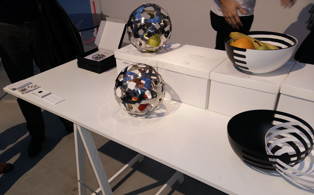
Two designers, one from Japan, the other from England, who opened together a design studio in Milan, More than One. At Operae they present Eclipse, a set of two fruit steel bowls that can be combined in different ways, and Kosmos, a spherical steel container that is just wonderful and can be transformed into a lamp too.
Mr. Nico
Mr. Nico is wooden laser cut jewelry, finished by hand. Is that enough for you? It should, but I would add a few details: the wood is carefully selected and comes exclusively from cultivation managed in an environment friendly way. Did you pay attention to the packaging? It is beautiful and obtained by using the part that would have been production waste. In short, a young, handsome, nice and careful project.
And yes, full of triangles.
Nina and other little things
Eloise Morandi developed a full line of stationery items around her poetic illustrations depicting Nina, a very sweet character, who reminds me of Little Red Riding Hood. The quality is high. The flipbook is really my thing and the anti-stress calendar is simply brilliant. When you’ll see the pop-up lamp you will faint, as it is so beautiful. I do not say too much, because it is really worth to browse the website: do not miss the video section.
“Nina exists only if you see her, and not everyone can”
Tonki
The idea is simple: tonki let you print your Instagram photos to decorate your walls. Design is even simpler and for this reason it is of great impact, because its presence is clear but not overwhelming. In the end, the story behind Ruggero’s idea is soooo romantic to make a difference: you can read it here (in italian only).
>> you can find all my posts about Operae here <<


